
Primary Propaganda
Primary Propaganda (2011) from Oldmateo on Vimeo.
Theory Reference Statement
Primary Propaganda
2011, 4min 19sec, 1080P video, four channel video installation
Permanent link: http://darkeuphoria.info/primary-propoganda/
Vimeo link: https://vimeo.com/41703510
This installation is a conceptual exploration of movement across multiple video frames and a response to the exploitation of primary colours to advertise and sell consumer electronics and software services. It is also a personal response to the feeling of alienation that technology and information can evoke in a dense urban environment. This work appears in a discussion about the use of primary colour symbolism in the chromatic painting experiments of Robert Delaunay, the advertisements by Samsung and Sony as well as the corporate iconography of Microsoft and Google (see thesis, pages 83-86).
Primary Propaganda is a reaction to the increasing use of primary colours in the marketing and image making of consumer electronics and big technology firms like Samsung, Sony and Google to convey teh communication of information, the speed of data transfer, the intelligence of machines and/or the fidelity of image reproduction. With reference to the chromatic painting explorations of Robert Delaunay the work attempts to draw a parallel between the visual iconography of turn of the century Futurist movement and the contemporary millennial representations of the invisible. There is also an undercurrent of mourning in this piece which reflects the listlessness of technological dependence and the arbitrary power of nature. Urban sequences were captured in Tokyo airport and the pedestrian crossing in Shinjuku, while the balloon sequence was filmed in Townsville Australia.
Documentation
-
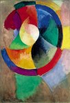
- Robert Delaunay (1912-13) Circular Forms, Sun No. 2


Some Background
The riot of colour and the swirling circular shapes of Robert Delaunay’s painting and that of his Futurist contemporaries, particularly Boccioni and Carrá, form an important juxtaposition against the representation of software processes, image reproduction and wireless communications in contemporary new media communication networks. Understanding the depiction of the physical and the virtual in a way that moves beyond the Cubist play on perspective and representation and becomes a celebration – if not a propaganda tool – of technological invention itself is vital in this context.
 Circular Forms, Sun No. 2 (flickr.com)")
Robert Delaunay (1912-13) Circular Forms, Sun No. 2
In Robert Delaunay’s early sequence of studies of chromatic painting – based on M. E. Cevreuil’s theory of ‘simultaneous contrasts’ – we can see that the dramatic use of primary colours in contrast and in symmetry with shape and movement convey a familiar visual iconography. In Circular Forms, Sun No. 2, from a series of works completed in the summer of 1912, Delaunay attempts to portray the array of colours he witnessed in his “retinal reactions” upon closing his eyes after staring intently at the midday sun. Here we can see the contrasting polychromatic colours of yellow, red, blue and green set in a circular motion, the planes of colour representative of the prismatic view of the sun’s “disk shaped blotches” [Sonia Delaunay in (Popelard 2009)]. The study of colour, of light and of movement is central to the Futurist theory of simultaneous expansion, in which light is a “sensation”, its parts a distillation of form and the composition itself a “synthesis of what one remembers and what one sees” (Boccioni et al. 1912).
The use of colour and symbolic shapes as metaphors for the potential exposition of the human consciousness and the technological possibilities of the network in contemporary society is also evoked in the corporate branding of the information economy. Microsoft’s use of the “window” to navigate applications and open up new ”vistas” is clearly evident in the design of its logo and the animated sequence of its operating system upon machine start-up. Here primary contrasting colours are used to symbolise multi-tasking, variations in application usage and the more abstract functions of the computer’s contemporary iteration as a mobile, multi-function, media production tool. Google too makes use of a similar chromatic palette in the design of its web search tool and in particular its web browser Chrome. Here the window is the gateway to the world beyond the screen, both real, analogous and fictitious, and the Chrome logo clearly evokes Delaunay’s experiments with simultaneism and chromatic painting. The circular structure of the logo provides a direct link to his series of Circular Form studies and extends upon it to include depth and three dimensional space which in itself is so typical of Web 2.0 iconography.[1] To reinforce this notion the an in-house production team at Google Japan created a stop animation advert for the launch of the Chrome browser consisting of wooden blocks which are manipulated by an invisible force to eventually mimic the interface of the browser. Here the palette of the Futurist chromatic colour scheme is most evident as the primary colours of red, yellow, green and blue are represented by building blocks which constitute the abstract notions of search and the broad spectrum of the possible results.
Further to this, in May 2010, Google released a viral video dramatically illustrating the relationship between software search technology and the concept of speed. In a sequence of “tests”, the load times of various web pages are measured against the performance of various backyard measurement devices – variously a potato gun, a loud speaker and a simulated lightning strike. Captured with a Canon Phantom v640 High Speed Camera at 2700 frames per second the first sequence of the video depicts a potato gun shooting a potato through a vegetable slicer across the face of an LCD monitor which is simultaneously loading a web page. As if in an attempt to demystify the mathematical complexity of screen response times, internet bandwidth and search algorithm technology the mechanism for firing the potato is a complex arrangement of DIY domestic objects. A salt shaker falls onto the “trigger”, the spark ignites a fuel of vapour, the potato is ejected through a vegetable slicer which sprays the raw potato slices across the face of the screen to finally land in a deep fryer where we presume they will transform into perfectly cooked French Fries, Google style.
Reference Material
[1] The origins of the Google Chrome logo are an interesting case in point. The webosphere has attempted to decode the logo into its various parts by graphically linking the logos various elements with well known and obscure pop cultural moments. The glowing blue orb at the centre of the logo has been attributed to the SAL 9000 computer from the film 2010, the sequel to 2001: A Space Odyssey, and the composition of the logo has been linked to a webcam, the logo for Pokemon Pokeball, the 1980s consumer electronics toy Simon Says and the logo for an obscure office application ThinkFree Office 3.
")
")
")
")
")
")
")
")
")
")
")
")

I was convinced it was a reference to Simon Says, but then I am an old codger
October 28, 2011 at 4:36 pm